
Symbols of Fluffy Favourites and How They Shape the Game Experience
What Symbols Represent in the Fluffy Favourites Series
I approach the Fluffy Favourites series from a simple premise: if you want to understand how these games work, you do not begin with paytables, features, or mathematical promises. You begin with the symbols. In Fluffy Favourites, symbols are not ornamental assets placed on the reels to decorate an underlying system. They are the system’s primary language.
What immediately distinguishes this series is the way symbols carry responsibility. Each icon communicates role, value, and behaviour without explanation. There is very little reliance on instructional overlays or explanatory text. Instead, meaning is embedded directly into visual form. The player is not told how the game works; the player reads it.
This design choice is not accidental. Fluffy Favourites is built around accessibility, but not in a simplified or reductive sense. Accessibility here means clarity. The symbols are designed to be recognised, prioritised, and interpreted at speed. From the very first spin, the player is invited to understand the structure of the game intuitively rather than analytically.
Symbols therefore operate as functional units rather than passive elements. Their shapes, colours, and relative prominence are carefully calibrated to signal hierarchy. High-value symbols assert themselves visually. Lower-value symbols recede without becoming invisible. Special symbols occupy a distinct conceptual space, separating themselves from standard outcomes through recognisable visual logic rather than exaggerated animation.
This is why a dedicated discussion of symbols is not supplementary but essential. In Fluffy Favourites, symbols define pacing, guide attention, and frame expectation. They are the interface through which the entire experience is delivered. Remove them, and the series loses its identity. Understand them, and the games become immediately legible.
Why Fluffy Favourites Symbols Feel Instantly Familiar
Comparison
Why it feels familiar at a glance
Three quick snapshots, one shared rule-set: your eye keeps finding the same priorities even when the layout changes.
One of the most consistent reactions players report when encountering a Fluffy Favourites game for the first time is a sense of recognition. This is not because they have memorised previous titles in the series, but because the symbol language feels immediately understandable. Familiarity here is not nostalgia; it is structural.
The series relies on repetition with purpose. Symbol roles recur across different games, even when mechanics evolve. This creates a shared visual grammar. Once learned, it transfers effortlessly. A player does not need to re-evaluate every icon or reassess its importance. The symbols behave in ways that align with visual expectation, reducing uncertainty and friction.
This familiarity is reinforced by restraint. The series avoids excessive variation in symbol design. New elements are introduced carefully and usually inherit established visual logic. Shapes remain bold and readable. Colour palettes stay within recognisable ranges. Characters retain expressive simplicity rather than detailed complexity. The result is coherence rather than novelty for its own sake.
Crucially, this sense of familiarity is achieved without uniformity. Symbols are not duplicated mechanically across games; they are adapted. Their appearance and function evolve in response to different formats, but their role identity remains stable. This allows the player to transfer understanding without confusion. Learning becomes cumulative rather than repetitive.
From a cognitive perspective, this matters. When symbols feel familiar, attention is freed for anticipation rather than interpretation. The player focuses on outcomes, not decoding. This reduces cognitive load and supports longer, more comfortable sessions. The game feels welcoming not because it is shallow, but because it respects the player’s capacity to recognise patterns.
In Fluffy Favourites, familiarity is engineered. It is the product of consistent symbol logic applied across a series rather than a single title. The symbols do not ask for trust; they earn it through predictability and clarity. That is why the series feels approachable from the first spin, even when the underlying mechanics differ.
Symbols as the Core Interface of the Series
Flow diagram
How symbols replace the traditional interface
This is the simplest version of what happens on every spin: a symbol appears, your attention snaps into place, an expectation forms, and the outcome resolves without you needing an instruction screen.
In the Fluffy Favourites series, symbols are not layered on top of the game as visual flavour. They form the core interface through which the player understands everything that happens on the reels. Instead of relying on written instructions or complex rule descriptions, the series communicates almost entirely through symbol behaviour and visual hierarchy.
From the first moments of play, symbols establish order. The player quickly learns where to look, what matters, and what can be safely ignored. This happens without conscious effort. Larger, clearer, more expressive symbols naturally draw attention, while simpler elements fade into the background. This is not accidental decoration; it is interface design expressed through art.
What makes this approach effective is consistency. Symbols do not change their meaning unexpectedly. When a symbol appears, it behaves in line with what its visual design suggests. There is no disconnect between appearance and function. Over time, this creates trust. The player does not feel the need to double-check rules or question outcomes, because the interface behaves predictably.
Another important aspect is pacing. Because symbols carry meaning so efficiently, the game does not need to pause or interrupt play to explain itself. Spins flow continuously. Outcomes are understood at a glance. This keeps the experience smooth and prevents cognitive fatigue, particularly during longer sessions.
In many slot games, the interface exists alongside the symbols. In Fluffy Favourites, the symbols replace the interface. They guide decision-making, shape expectations, and structure the entire experience. This is why understanding the symbols is equivalent to understanding the game itself.
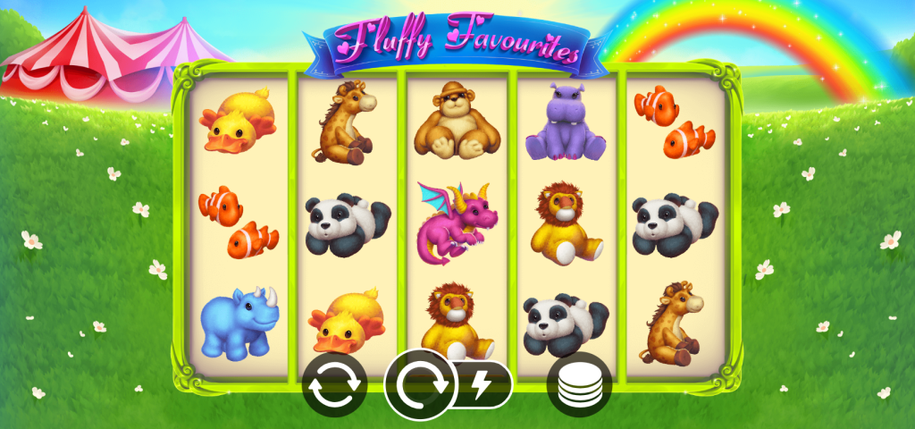
Symbol Categories in Fluffy Favourites
Symbol categories
A system view of the symbol set
Instead of treating icons as a long list, this table groups them by job. Category tells you what the symbol is for, how it behaves, and what it makes the player feel before the outcome resolves.
| Category | Visual role | Behaviour | Player perception |
|---|---|---|---|
Low-value symbols | Designed to sit quietly in the background: simple shapes, low “visual weight”, and minimal distraction. | Stable and predictable. They mainly support the reel’s pacing and keep attention available for higher-priority icons. | Feels calm and easy to parse. The player understands these symbols are present, but not central to decision-making. |
High-value animal symbols | The “centre of attention” layer: bolder silhouettes, clearer colours, and instantly recognisable character forms. | Behave as the main pay icons. Their impact is defined by visibility and consistency rather than hidden rules. | Creates anticipation through recognition. Players sense importance without consulting a paytable. |
Special symbols | Visually distinct, but still within the same style. Their design signals function, not just value. | Activate or modify systems: substitution, event starts, or outcome modifiers depending on game state. | Feels like “something is happening”. The symbol is read as a switch in the interface, not merely another icon. |
The clarity of the Fluffy Favourites series is largely the result of a well-defined symbol structure. Symbols are organised into distinct categories, each serving a specific purpose within the overall system. These categories are not presented explicitly, yet they are immediately recognisable through design and behaviour.
Low-value symbols provide stability. They fill the reels without demanding attention, creating a visual baseline against which more important symbols can stand out. Their simplicity is deliberate. They reduce noise and prevent the reels from feeling crowded. Even though they represent lower outcomes, they are never visually weak or poorly defined. This ensures that the game feels cohesive rather than fragmented.
High-value animal symbols occupy a different space entirely. These symbols are designed to be noticed. Stronger colours, clearer outlines, and more expressive forms communicate importance instantly. Players do not need to consult any table to understand that these symbols matter more. Their presence alone is enough to shift attention and raise anticipation.
Special symbols sit outside the normal hierarchy. Their role is not to compete with other symbols in terms of value, but to signal change. When they appear, the game state feels different. This distinction is achieved visually rather than through dramatic effects. The design tells the player that the rules are about to shift, even before the outcome is resolved.
What is particularly effective is how cleanly these categories interact. There is no ambiguity about what a symbol represents or how it should be interpreted. Each category reinforces the others, creating a balanced visual system where meaning is distributed logically rather than evenly.
This structured categorisation allows the series to remain readable across different formats and mechanics. Even when new elements are introduced, they are integrated into an existing framework rather than added on top of it. As a result, the player is never overwhelmed. The symbols speak clearly, each in its own role, within a system that values order over excess.
The Elephant Symbol: The System Icon of Fluffy Favourites
Wild role
Acts as a universal connector. The elephant substitutes other symbols, smoothing the reel and increasing continuity without changing visual language.
Scatter role
Signals a state shift. The same symbol now communicates progression, not value — the player reads “something is starting”.
Modifier role
Alters behaviour rather than pays directly. The elephant becomes a system switch, influencing outcomes already in motion.
Elephant symbol
One visual anchor, multiple functional meanings. Its job changes with context, but recognition never resets.
Visual continuity
The symbol keeps its identity even when acting differently, preventing interface overload during high-impact moments.
Expectation trigger
Players associate the elephant with upcoming change, not with a single mechanic or rule description.
System control
Instead of buttons or menus, the elephant silently performs interface work inside the reels themselves.
Within the Fluffy Favourites series, the elephant symbol occupies a position that goes beyond standard classification. It is not simply another special icon placed on the reels; it functions as a structural anchor for the entire symbol system. Its repeated presence across the series establishes continuity and gives the games a recognisable internal logic.
The elephant’s importance lies in its multi-role design. Rather than introducing separate symbols for separate functions, the series assigns multiple responsibilities to a single, visually dominant icon. Depending on the game and state, the elephant can replace other symbols, initiate key events, or modify outcomes. This consolidation is intentional. It reduces the number of concepts the player must learn while increasing the symbolic weight of one central element.
Visually, the elephant is designed to justify this role. Its size, posture, and clarity distinguish it immediately from standard symbols. The player does not need prior knowledge to understand that this symbol matters. Its appearance signals importance before any mechanical effect takes place. Over time, this creates a strong association between the symbol and moments of heightened significance within the game.
What makes this approach effective is restraint. The elephant does not appear constantly, nor does it overwhelm the reels when it does. Its impact comes from timing rather than frequency. When it enters play, attention shifts naturally. The symbol feels earned, not imposed, which reinforces its authority within the system.
By assigning multiple functions to one recognisable symbol, the series avoids fragmentation. There is no need for a growing collection of narrowly defined icons. Instead, meaning accumulates around a single figure. This creates coherence across games and formats, allowing players to transfer understanding without re-learning fundamentals.
In this sense, the elephant is not just a symbol within the game. It is a symbol of the series itself. Its design and behaviour reflect the broader philosophy of Fluffy Favourites: clarity over complexity, recognition over explanation, and structure over excess.
Mechanic-Driven Symbols: When Symbols Trigger Systems
Interactive lens
Pay symbols vs mechanic symbols
Everything on the reels looks like an icon, but not everything behaves like one. Use the lens to separate symbols that resolve value from symbols that change what the game is doing.
Not all symbols in Fluffy Favourites exist to resolve outcomes directly. Some are designed to act as gateways rather than endpoints. These mechanic-driven symbols introduce a different layer of interaction, where the appearance of a symbol signals a shift in how the game operates rather than an immediate result.
These symbols function as triggers. Their role is to activate systems, features, or secondary processes that unfold over time. When they appear, the player understands that the game is moving into a different mode of behaviour. Importantly, this understanding comes from visual signalling, not from interruption or instruction.
What distinguishes these symbols is their separation from value-based hierarchy. They are not positioned as higher or lower than standard symbols in terms of worth. Instead, they exist on a parallel track. Their presence changes context rather than outcome. This helps prevent confusion, as players do not evaluate them through the same lens as regular pay symbols.
Design plays a crucial role here. Mechanic-driven symbols are visually distinct but stylistically consistent. They stand apart without breaking the established aesthetic. This balance ensures that their function is clear without making them feel foreign to the system. The player recognises them as part of the same visual language, simply serving a different purpose.
From a behavioural perspective, these symbols introduce anticipation rather than resolution. Their appearance often leads to a sequence rather than a result. This extends engagement without increasing complexity. The player understands that something is beginning, not ending, which shifts attention from calculation to observation.
By incorporating mechanic-driven symbols, the Fluffy Favourites series expands its expressive range without overcrowding the interface. Symbols are allowed to represent actions, transitions, and states, not just outcomes. This reinforces the idea that in this series, symbols are tools of communication first and rewards second.
Symbol Behaviour Across Different Game States
Split comparison
The same symbols, different state behaviour
Base game and feature mode do not replace the symbol set. They change what the same icons mean in the moment. This split makes the shift readable without making it feel like new rules.
A defining strength of the Fluffy Favourites series is the way symbol behaviour adapts to different phases of play without undermining clarity. Symbols do not exist in isolation; they respond to context. The same icon can carry different weight depending on whether the game is in its base state or within a feature, yet this shift never feels arbitrary.
In the base game, symbol behaviour is deliberately stable. Icons perform their expected roles with minimal variation. This creates a reliable foundation on which the rest of the experience is built. The player learns the visual hierarchy early and can trust it. There are no sudden reversals or hidden conditions. Outcomes feel earned and understandable, even when they are unfavourable.
This stability serves an important psychological function. It anchors expectation. By keeping symbol behaviour consistent in the base game, the series ensures that any later deviation feels meaningful rather than confusing. The player understands that change only occurs when the game explicitly enters a different state.
During feature or bonus states, symbol behaviour expands rather than breaks. Symbols are not replaced wholesale; their roles are extended. An icon that was previously neutral may gain influence. A symbol that already carried significance may become more expressive. Crucially, these changes are signposted visually. The player is not expected to remember hidden rules or conditional modifiers.
This layered approach allows complexity to emerge gradually. The player experiences evolution instead of disruption. Symbol behaviour feels like a natural progression rather than a mechanical trick. Even when features introduce new interactions, they remain grounded in the established symbol logic of the base game.
By managing behaviour across game states so carefully, the Fluffy Favourites series maintains coherence. Symbols remain readable at all times. The player is never forced to re-learn the system mid-session. Instead, understanding deepens organically as the game moves between states.
Visual Consistency Across the Fluffy Favourites Series
Series strip
Symbols migrate, the visual language stays
Even when a new entry changes pacing or features, the symbol “alphabet” remains recognisable. This strip shows how the same core shapes and icon hierarchy carry across the series.
Visual consistency is one of the most understated yet powerful elements of the Fluffy Favourites identity. Across different games, formats, and mechanical variations, the symbols retain a shared design language that binds the series together. This consistency is not repetitive; it is structural.
Symbols migrate between games with their identities intact. While their exact appearance may be refined or adapted, their core visual cues remain recognisable. Shape, posture, and relative prominence are preserved, ensuring that players can identify roles instantly even in unfamiliar environments.
This approach supports continuity. When a player moves from one title in the series to another, there is no sense of starting from zero. Familiar symbols carry familiar expectations. This reduces entry friction and allows players to engage with new mechanics more confidently.
Consistency also reinforces trust. When symbols behave in ways that align with their visual history, the series feels dependable. The player does not feel misled by cosmetic similarity masking functional difference. Instead, design and behaviour move in parallel.
Importantly, visual consistency does not limit flexibility. The series accommodates different reel structures, feature systems, and pacing models while maintaining a unified symbol framework. Symbols adapt without losing identity. This balance between stability and variation is difficult to achieve, yet it is central to the longevity of the series.
Through consistent symbol design, Fluffy Favourites establishes a visual contract with the player. Once learned, it remains valid. Each new game builds on existing understanding rather than replacing it, allowing the series to evolve without fragmenting its core experience.
Mobile-First Symbol Design and Readability
Mobile-first
Designed for the smallest screen first
On mobile, symbols cannot rely on explanation. They must carry meaning instantly, with no room for noise or secondary UI layers.
The Fluffy Favourites series demonstrates a clear commitment to mobile-first design, and nowhere is this more evident than in its approach to symbols. Rather than adapting desktop visuals for smaller screens, the series builds symbol readability from the smallest format upward. This ensures that clarity is preserved regardless of device.
Symbols are constructed around strong silhouettes. Detail is deliberately restrained, allowing each icon to remain legible even when reduced in size. This is particularly important on mobile screens, where visual noise can quickly overwhelm perception. In Fluffy Favourites, symbols retain their identity at a glance, without requiring focus or zoom.
Contrast plays a central role. Colour choices are not purely aesthetic; they are functional. Foreground symbols stand out clearly against reel backgrounds, and important icons maintain separation from surrounding elements. This helps guide attention naturally, even during fast-paced play or rapid sequences of spins.
Spacing is equally important. Symbols are given room to breathe. They are not compressed or layered in ways that obscure meaning. This supports visual comfort over extended sessions and reduces eye strain. The reels feel orderly rather than crowded, which contributes to a calmer overall experience.
Mobile-first readability also supports consistency. When symbols are designed to perform well on smaller screens, they inevitably perform even better on larger ones. This creates a unified experience across devices, where no version feels like a compromise.
By prioritising mobile readability at the symbol level, the Fluffy Favourites series ensures that its visual language remains accessible and effective in modern play environments. Symbols do not merely survive the transition to mobile; they are optimised for it.
How Symbol Design Reduces Cognitive Load
Cognitive load
From noise to a readable system
The easiest way to feel cognitive load is to watch what your attention does. A noisy screen makes you search. A clean symbol system lets you recognise. This diagram turns that idea into a simple before/after.
72higher load
Before: attention is spent on decoding
When everything competes for importance, the player scans the whole screen. Recognition is slow because hierarchy is unclear.
In a clean symbol system, attention is guided. Players do not hunt for meaning — they recognise it, then follow it.
A defining characteristic of the Fluffy Favourites series is how little mental effort is required to understand what is happening at any given moment. This is not the result of simplification, but of careful symbol design aimed at reducing cognitive load.
The series limits the number of roles each symbol can perform. Even when symbols serve multiple functions, these functions are logically connected and visually signposted. This prevents the player from juggling unrelated meanings or remembering conditional exceptions.
Repetition is used constructively. When symbols behave consistently across sessions and games, recognition replaces recall. The player does not need to actively remember rules; familiarity handles the work. This frees cognitive resources for engagement rather than interpretation.
Visual hierarchy further supports this reduction. The eye is guided naturally toward what matters most. Less important elements recede without disappearing, ensuring that attention is allocated efficiently. There is no need to scan the entire screen constantly in search of significance.
The absence of visual clutter also plays a crucial role. By avoiding excessive animation, unnecessary effects, or overly detailed artwork, the series maintains a clean visual environment. Each symbol communicates clearly without competing for attention.
As a result, the player experiences flow rather than fatigue. Understanding is continuous and uninterrupted. Symbol design in Fluffy Favourites does not ask the player to think harder; it allows the player to think less, without sacrificing depth or engagement.
How Players Perceive Symbols in Fluffy Favourites
Player perception in the Fluffy Favourites series is shaped less by outcomes and more by how symbols behave moment to moment. This distinction is important. The experience does not rely on dramatic swings or constant stimulation. Instead, it builds confidence through visual stability and behavioural consistency. Players feel oriented, not pressured.
Symbols contribute to a sense of calm control. Because their roles are clear, players rarely feel lost or uncertain about what they are seeing. Even when results are unfavourable, the process remains understandable. There is no sense that something important has happened off-screen or without warning. This transparency strengthens trust in the system.
Another key aspect of perception is emotional neutrality. Symbols are friendly without being distracting. They are expressive enough to create character, but not so animated that they dominate attention. This balance prevents emotional fatigue. The player can remain engaged without feeling overstimulated, which is particularly valuable during longer sessions.
Perception is also shaped by fairness. When symbols appear, behave, and resolve in line with expectation, outcomes feel justified. This does not mean predictable, but coherent. Players are more likely to accept variance when they understand how and why it occurs. Symbols play a central role in delivering that understanding visually.
Over time, this consistency encourages a relaxed form of engagement. Players stop analysing and start observing. The game becomes something that unfolds rather than something that must be constantly monitored. Symbols support this by remaining readable, stable, and honest in their presentation.
In Fluffy Favourites, positive perception is not engineered through excitement alone. It is built through reliability. Symbols earn confidence by behaving as they look, and by maintaining that behaviour across sessions and games.
Symbols vs Paytables: What Actually Drives Understanding
In many slot games, the paytable is treated as the definitive source of truth. It is where players are expected to learn value, hierarchy, and importance. In the Fluffy Favourites series, this relationship is reversed. Understanding is driven primarily by symbols, with the paytable serving as secondary confirmation rather than instruction.
Most players rarely consult paytables during active play. Fluffy Favourites acknowledges this reality and designs accordingly. Symbols communicate priority visually, allowing players to interpret outcomes without reference material. The paytable exists, but it is not required for comprehension.
This shift has practical consequences. When symbols carry meaning independently, the game becomes more intuitive. Players do not need to interrupt play to verify information. Understanding happens in real time, through observation rather than reference.
Symbols also convey relative value more effectively than numbers. Visual weight, frequency, and behaviour communicate importance faster than numerical comparisons. A player can feel which symbols matter most without knowing exact figures. This aligns with how people naturally process visual information.
By placing symbols ahead of paytables in the hierarchy of understanding, the series creates a more fluid experience. Learning is embedded in play rather than separated from it. The player is not studying a system; they are interacting with one.
In this context, paytables become supportive rather than foundational. They confirm what the player already understands through symbols. This inversion is a defining characteristic of the Fluffy Favourites approach and a key reason why the series remains accessible without sacrificing structure.
Common Questions About Fluffy Favourites Symbols (FAQ)
Symbols and behaviour
A focused FAQ on symbol consistency across the series and how behaviour changes during features without breaking the core visual logic.
Why Symbols Define the Fluffy Favourites Experience
The Fluffy Favourites series demonstrates that effective slot design does not begin with complexity or spectacle, but with communication. At the centre of that communication sit the symbols. Throughout the series, symbols are treated not as decorative elements or interchangeable assets, but as the primary medium through which structure, logic, and intent are expressed.
What sets this approach apart is discipline. The symbol set is restrained, purposeful, and consistent. Each symbol has a clear role, and those roles are reinforced visually rather than explained verbally. This allows understanding to emerge naturally through play. Players are not required to memorise systems or consult external references. The game teaches itself by behaving coherently.
Across different titles in the series, this philosophy remains intact. Mechanics evolve, formats shift, and features expand, yet the symbol language persists. Familiar icons continue to guide attention and signal importance, creating continuity across experiences. This continuity is not superficial; it is structural. It allows players to approach new games with confidence rather than caution.
The importance of this design choice becomes most apparent over time. Long sessions remain comfortable because symbols do not compete for attention or demand constant interpretation. Short sessions feel immediately accessible because the interface is readable from the first spin. In both cases, symbols support flow rather than interrupt it.
By placing symbols ahead of paytables, instructions, and overt guidance, the Fluffy Favourites series respects how players actually engage with games. Visual understanding is prioritised over numerical explanation. Meaning is embedded in form, not hidden in menus. This creates an experience that feels transparent, fair, and approachable without being simplistic.
Ultimately, symbols define the Fluffy Favourites experience because they carry the weight of the design philosophy itself. They are the point where clarity, consistency, and usability converge. To understand the symbols is to understand the series, because everything else is built around the visual logic they establish.